HK Commute
One-tap quick glance at the daily commute schedule

https://github.com/mevtho/commutehk/
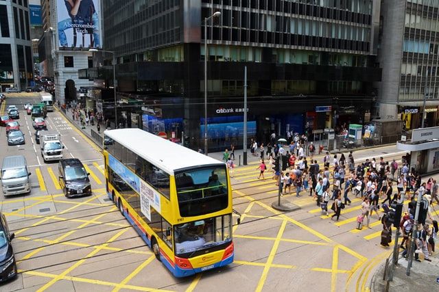
Commuting ... For the past few months, one of my main activities has been to check when is the next / best bus to commute with.
The frequency is quite good as several routes work. The bus stop is right below the building. Reaching it takes 2 to 3 minutes.
However, it is nice to know when a bus comes. It is easier to adjust the timing and know if it is necessary to rush or not.
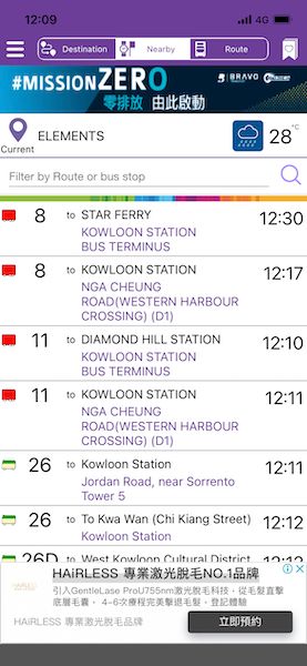
For a long time, I have been using the default application provided by the Hong-Kong transportation system. It works, kind of, it gives the next buses around, all the routes, and only the next buses. In short, finding the relevant information involves a lot of scrolling, clicking, ... through a non-intuitive interface. To add to the matter, it displays some ads and force a click to access the list. Small annoyances, but, over time, they all add up...

Couldn't I use google or any other, ... possibly, but, I am not convinced nor found it more useful to be honest. I still prefer that initial app.
This changed when I learnt about the Open Data coming from the Hong Kong government (https://data.gov.hk/en/). It is possible to get the same data, the ETA of buses and metro at a specific stop through an API.
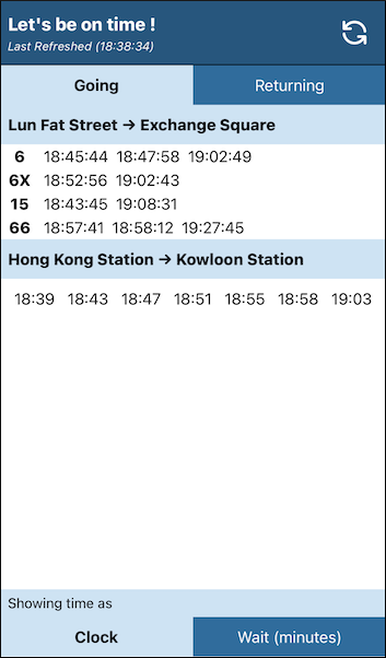
So of course I wrote my own web page that focuses only on my route. It gathers all the information I need in seconds. With as little effort as possible I can determine which bus I should target. It also gives me more information. Despite knowing that the predicted time down to the second won't be accurate. I find it useful to know if it is expected at the beginning of the minute or at the end of it. 8:45:03 is quite different to 8:45:54 in the current context.

The great thing is, now. I can glance at all the information I need in a matter of seconds.
In 2 or 3 taps, I get access to the one way or the other as well as either the time of the bus or how long to wait. No need to do the calculation anymore ...
A bookmark to the page created later, and with a single tap on the screen I am able to get what I need.

Important note, if you are looking to make a bookmark shortcut, make sure to create an icon for your page,especially if it takes some time to load. By default, on iphone, a screenshot of the page will be displayed. If for any reason your page doesn't show anything within the expected time frame, you'll end up with a blank square... If your page often changes, the display will also often change... Make it more static with a dedicated icon. It's easy ...
Now, the display is still not the best. After few days of usage, I realized that I didn't need to have the data by bus line... All I need is to know when is the next bus that I can realistically use... A one column display, gathering all the data as one line per incoming bus would be much more efficient. Well, that's next on the list. When it becomes too annoying as is.

